Since the beginning of internet we are collecting data. Search engines such as AltaVista, Yahoo search and Google slowly started to get bigger and gave us more and more insight. If you were looking for something, these search engines could always give you a answer.
“But what if you get lost inside a system?”
At Basecone we believe there should always be a path to follow, a system should be build so everybody knows what is going on or were it is leading to. The first version of Basecone was relatively simple. Feedback from our first clients was clear: keep it simple and maintain a good overview of the system. As Basecone developed further, the rapidly increasing number of users and all their wishes made it harder for Basecone to fulfil every wish. Accessibility and clarity are essentials for a user, but very hard to maintain when you want to offer more and more to (potential) users..
Keeping in mind that Basecone should be so easy to use, so intuitive and therefore must remain approachable we started a few months ago on reviewing our current application. Especially focussed on the ease of Basecone. Is Basecone still easy to use and are our users still finding their way? Not only within our current application, but also in the application of tomorrow. What kind of limitations do our users experience within Basecone?

It is also important to realise that each user of Basecone has expectations while using Basecone. To allow all users to operate as efficient as possible, we are going to look at the specific roles they perform. To let all the users work as good as possible with Basecone and still keep it simple and intuitive we have to make choices. In order to make these choices, we chosen two starting points:
1. Do not search, but find it
A user does not want to look for what he needs to do, applications should let them know. By sending reminders through usual channels (WhatsApp, text or email) we bring our users with one simple click to where they should be. By notifying them inside the system for a action or where action should be taking is a first, but if you could perform this action with one simple click, then you are helped.
2. Minimise the number of movements and clicks
On average the mouse of a user travels a distance of 1,5km a week, 6km a month and even 312km per year! By continuously focusing on reducing the number of movements and clicks we put our focus on how our screens are build, with in the back of our mind the different kinds of user behaviour.
A solution would be to give each user (with the associated features and the way each user works) a personalised screen. No features mixing in the same screen. If a user could be helped by finding what they are looking for with a maximum of 3 clicks, our system is clear and simple. Making choices with allot of noise don’t contribute to simplicity and ease.
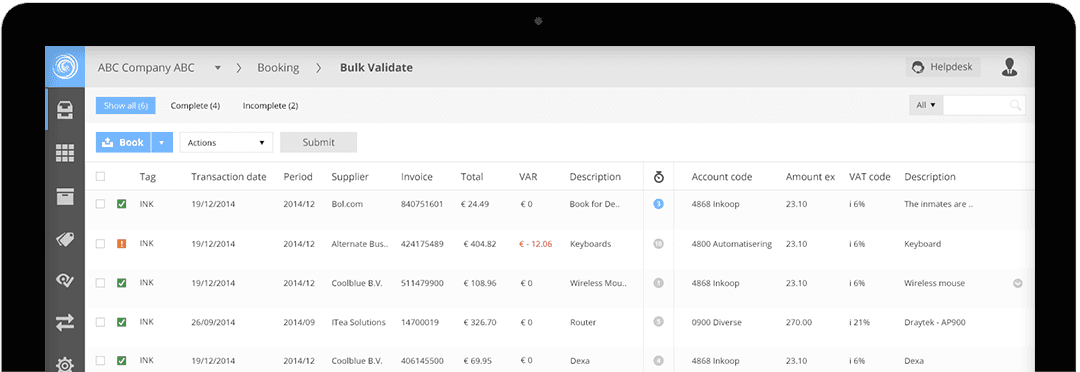
With this we went back to the basics: Navigation from screen to screen. Within the current application it normally takes more then 2 clicks to navigate between them. We people are used to navigate from left to right, which means our ‘ sweet-spot’ in our application is the left top of a screen. Why is the menu (most commonly used in Basecone) placed at the right top of the screen? In addition to this, most of the clicking (selecting document, administration) happens on the left side of the screen. No surprise, but quite a painful conclusion.
We started of with a few test screens and placed our menu on the left side of the screen. Easy to find and always reachable from the same place. The feedback of our testpanel were very positive and the navigation 100 times better, for Basecone a step in the right direction! After this we kept improving the navigation, tweaked it and will release our changes soon.

Basecone roadmap
Changes can be difficult, that we know. One big bang and putting every screen upside down is not our intention. The introduction of our improvements will be gradual process. We will introduce the new navigation on the left side (vertical) and will keep the menu like users already know for now. In (short) time, once accustomed to the new setup, the old menu will disappear so we keep our system as simple as possible. With one click navigation between each screen.
But.. looks do matter, more information will be unveiled soon.


